Turn on suggestions
Auto-suggest helps you quickly narrow down your search results by suggesting possible matches as you type.
- Dynatrace Community
- Dynatrace
- Ask
- Open Q&A
- Display results as Table vs. Chart
Options
- Subscribe to RSS Feed
- Mark Topic as New
- Mark Topic as Read
- Pin this Topic for Current User
- Printer Friendly Page
Options
- Mark as New
- Subscribe to RSS Feed
- Permalink
27 Sep 2017
03:48 PM
- last edited on
21 Dec 2023
02:23 PM
by
![]() MaciejNeumann
MaciejNeumann
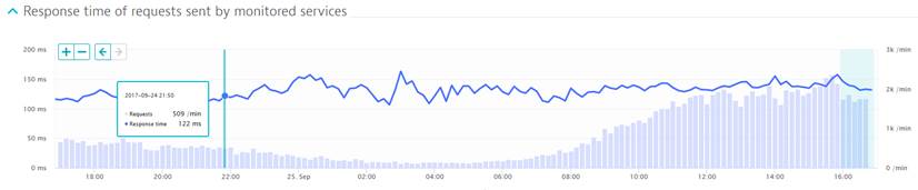
Can we display the results as table with 5 min points
summarized vs. chart? I
thought for sure we could do this but now that I try can’t’ seem to make it
work. We essentially want to see this view in table so we can do counts
and send information to vendors or other end. So
for this example a 5 min internal line that says 509 requests 122ms – then we
can add the columns/filter for type of service calls
Solved! Go to Solution.
Labels:
- Labels:
-
services
4 REPLIES 4
Options
- Mark as New
- Subscribe to RSS Feed
- Permalink
27 Sep 2017 04:35 PM
Hi Alicia,
You cannot show this as a table in the Dynatrace UI, but you could use the API to pull down the information you are looking for and put it into a table yourself. This is a bit more manual work, but could be done.
More information on the API can be found here: https://help.dynatrace.com/dynatrace-api/ . You will want to look in the "Time Series" section for more information on how to pull the metrics you are looking for.
Hope this helps some,
Hayden
Reply
Options
- Mark as New
- Subscribe to RSS Feed
- Permalink
27 Sep 2017 04:37 PM
Thanks we had found that also, any ideas if this is something coming in future? we have a lot of users and even ourselves where this be easier to pull in UI than this method.
Reply
Options
- Mark as New
- Subscribe to RSS Feed
- Permalink
27 Sep 2017
04:40 PM
- last edited on
16 Oct 2023
04:15 PM
by
![]() random_user
random_user
Hi Alicia,
I am not sure on the answer to that, but I think you have a good use case and adding this as a request for enhancement would be a good idea. You can do that on the Product Ideas forum here: https://community.dynatrace.com/spaces/483/view.html
Sorry I cannot provide an exact answer, but if I hear anything about this exact feature I will be sure to respond.
Options
- Mark as New
- Subscribe to RSS Feed
- Permalink
02 Mar 2018
09:45 PM
- last edited on
16 Oct 2023
04:07 PM
by
![]() random_user
random_user
Reply
