Turn on suggestions
Auto-suggest helps you quickly narrow down your search results by suggesting possible matches as you type.
- Dynatrace Community
- Dynatrace
- Ask
- Dashboarding
- Process group dashboard tile missing
Options
- Subscribe to RSS Feed
- Mark Topic as New
- Mark Topic as Read
- Pin this Topic for Current User
- Printer Friendly Page
Options
- Mark as New
- Subscribe to RSS Feed
- Permalink
03 May 2019 10:28 AM
I have noticed that process group tile was removed from dashboards. I have used it to visualize requests to apachehttp, tomcat servers at customer's dashboards.
It's possible to create custom tile however in
process group tile I was able to see which one process in pg is
performing badly (has lower number of requests). In custom graph tile i cannot immediately decide which process in monitored group has lower number of requests.What was purpose of removing this tile from dashboards ?
Alanata a.s.
Solved! Go to Solution.
Labels:
- Labels:
-
dashboards classic
-
process groups
Reply
6 REPLIES 6
Options
- Mark as New
- Subscribe to RSS Feed
- Permalink
03 May 2019 12:38 PM
tileType of mentioned tile is "PROCESS_GROUPS_ONE"
Alanata a.s.
Options
- Mark as New
- Subscribe to RSS Feed
- Permalink
03 May 2019 01:10 PM
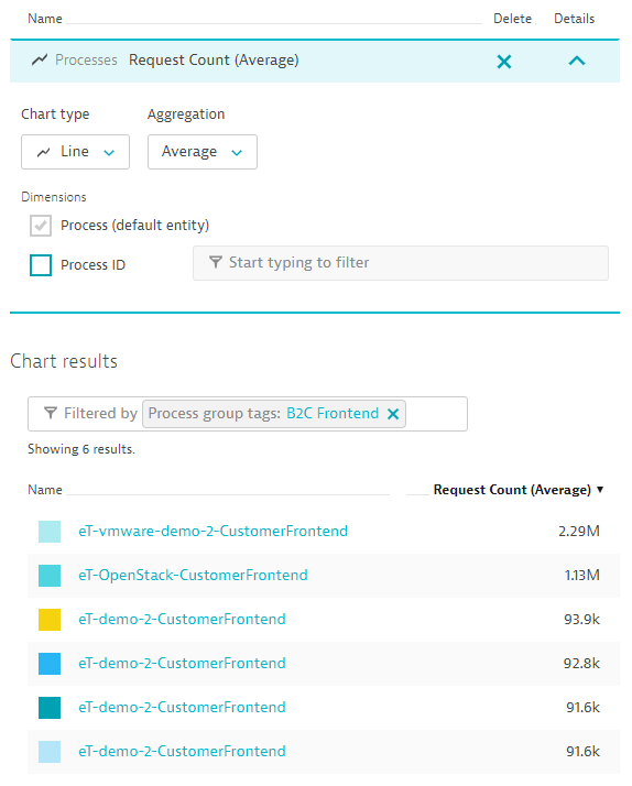
The metric "Processes - Request Count" filtered by a process group tag should give you what you're looking for, right?
Reply
Options
- Mark as New
- Subscribe to RSS Feed
- Permalink
03 May 2019 01:37 PM
this will produce custom graph tile, where you cannot decide specific lines per process. when you choose top list, then you can see process name but without history.
process group tile was pretty useful for us (we can see if one process processes less requests than other in one tile), is there a good reason why it was removed ?
Alanata a.s.
Options
- Mark as New
- Subscribe to RSS Feed
- Permalink
03 May 2019 01:41 PM
All our decisions are based on thorough consideration. In this case those reasons are supportability and performance/stability.
If I understand you correctly, you're missing the chart legend to see which color corresponds to which process. This will be added in the course of the following months. Until then, I'd advise you to put a toplist chart next to the line chart on your dashboard.
Options
- Mark as New
- Subscribe to RSS Feed
- Permalink
03 May 2019 01:49 PM
ok then, we will wait. should we expect that existing configured tiles in customer's dashboards will dismiss in some of next releases ?
Alanata a.s.
Options
- Mark as New
- Subscribe to RSS Feed
- Permalink
03 May 2019 01:50 PM
Yes, those will be transformed into regular custom charts as well.
