- Dynatrace Community
- Dynatrace
- Ask
- Dashboarding
- Re: Make a dashboard with a problems
- Subscribe to RSS Feed
- Mark Topic as New
- Mark Topic as Read
- Pin this Topic for Current User
- Printer Friendly Page
- Mark as New
- Subscribe to RSS Feed
- Permalink
21 Feb 2024
06:21 PM
- last edited on
26 Feb 2024
12:28 PM
by
![]() MaciejNeumann
MaciejNeumann
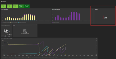
Hi, how are you all doing? I'm trying to visualize the problem dashboard in a chart, but so far, I haven't been able to do it. I can only pin the number of issues.
With this, I aim to group them by the same type of issue, understand how often they occur, and so on.
Solved! Go to Solution.
- Labels:
-
dashboards
-
metrics
- Mark as New
- Subscribe to RSS Feed
- Permalink
21 Feb 2024 06:24 PM
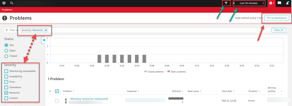
@Ellery you can set the filters as you desire and then in the upper right hand corner pin it to the dashboard. You might want to rename them so the numeric of problems is clear in terms of 5 Resource issues and 3 Availability issues etc...
You can slice and dice it any way you see fit from time frames to Management zones, tags and everything in between.
Here is a sample:
- Mark as New
- Subscribe to RSS Feed
- Permalink
21 Feb 2024 07:22 PM
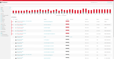
That's correct, but when pinning it to the dashboard, only the number of issues is displayed. We can add filters, but we can't group, for example: the number of pod restarts. Ideally, we'd have a metric to manage the issues effectively
for example I want make some this
- Mark as New
- Subscribe to RSS Feed
- Permalink
21 Feb 2024 07:00 PM - edited 21 Feb 2024 07:07 PM
Sadly the problem view is just that, a problem view. Can't manipulate to much info there. As @ChadTurner stated only play with a preset of filters of the UI and cant be charted.
The best way to aproach the use case is via DQL. Other ways is play with the API.
If you have access to grail in your tenant is something like this:
fetch events, from:now()-15d
| filter dt.system.bucket=="default_davis_events"
| filter isnotnull(display_id)
| summarize Cantidad=count(), by:{bin(timestamp,30m), alias:tiempo, event.name}
| sort tiempo desc
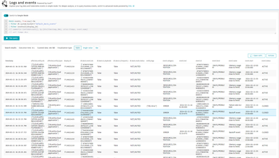
This will give you something like this, it will you give you a count of type of events by event.name in slots of 30m, can be changed to 1d and make the query to 7d and you have the view of problems in a week.
You can expand adding those events that are important to you or expand to the entities and see what entities have more problems.
Cheers.
- Mark as New
- Subscribe to RSS Feed
- Permalink
21 Feb 2024 07:36 PM
Thanks
Thank you very much, now I can create the charts and metrics to manage the issues effectively.
- Mark as New
- Subscribe to RSS Feed
- Permalink
21 Feb 2024 07:32 PM - edited 21 Feb 2024 07:41 PM
Are you a SaaS customer? You showcased the Davis Metric in the screen shot but thats just an example correct, you want groupings based off all your problem cards that showed up correct?
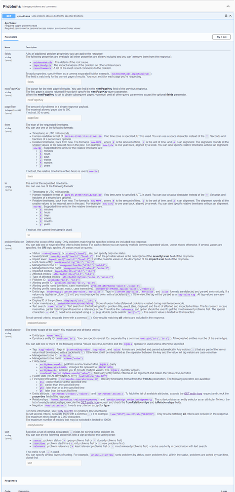
If DQL is out of the question for you, then I highly recommend looking at the Environment v2 API. You can target problems and add in groupings, filters etc to organize the data. But it wont be on a dashboard.
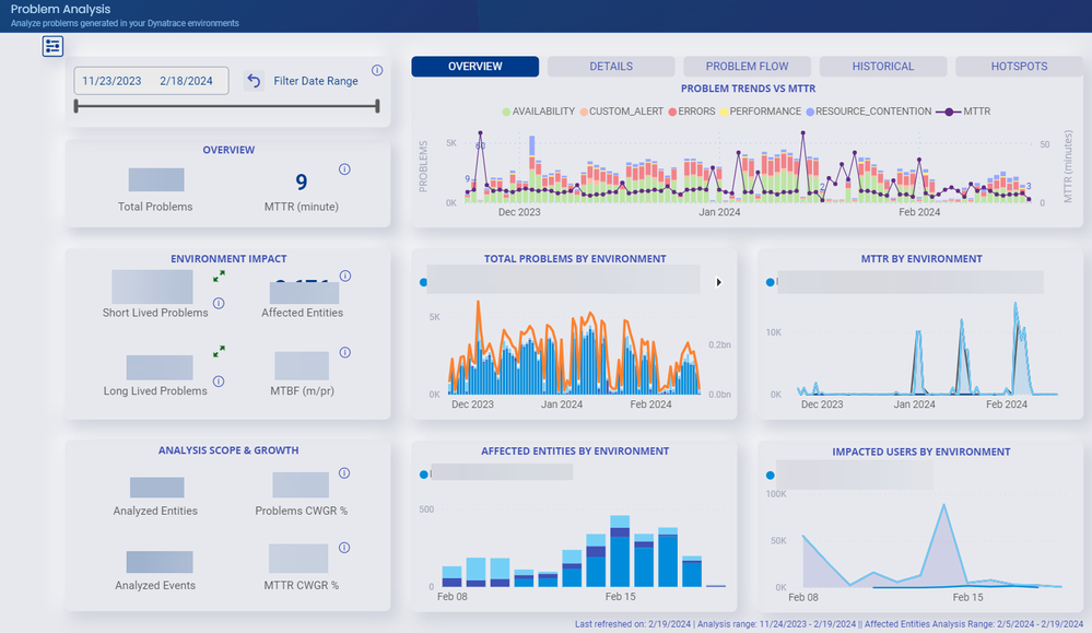
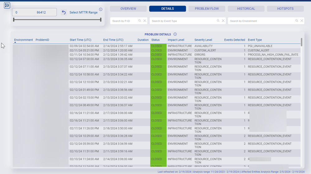
Now the last work around is is you are a SaaS customer. There is a services portal that will give you even more insights and ability to work the data in terms of problems:
It might be worth taking a look at. To gain access you'll need to reach out to your Dynatrace Account Reps.
