- Dynatrace Community
- Dynatrace
- Ask
- Dashboarding
- User Experience Dashboard - Basic
- Subscribe to RSS Feed
- Mark Topic as New
- Mark Topic as Read
- Pin this Topic for Current User
- Printer Friendly Page
User Experience Dashboard - Basic
- Mark as New
- Subscribe to RSS Feed
- Permalink
25 May 2023
03:21 PM
- last edited on
26 May 2023
08:35 AM
by
![]() MaciejNeumann
MaciejNeumann
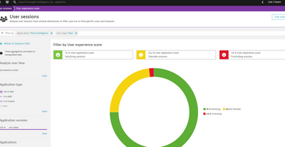
I simply want to show this on a dashboard for customer service and have it refresh every hour:
- Mark as New
- Subscribe to RSS Feed
- Permalink
25 May 2023 06:53 PM
Hi,
If you want that shape and colors, nearest is:
builtin:apps.web.actionCount.category:filter(and(or(in("dt.entity.application",entitySelector("type(application),entityName.equals(~"Fleet Intelligence~")"))))):splitBy("Apdex category"):sort(value(auto,descending))
Going to advance mode in Data explorer and copy and paste that code.
Be sure you override colors to red, orange and green in the right panel:
After that, you can ping it to a dashboard, and you can set a dashboard-specific timeframe to be showing only last hour data.
Be aware this is real and synthetic monitoring. I am not sure how to filter only real user data as you have filtered.
Best regards
- Mark as New
- Subscribe to RSS Feed
- Permalink
25 May 2023 07:46 PM
Thank you! As you noted, I want just real users, not synthetic included. And I also want to see the % of the pie as opposed to the actual number for each category. I appreciate you taking the time to help! Ts is all very new to me.


